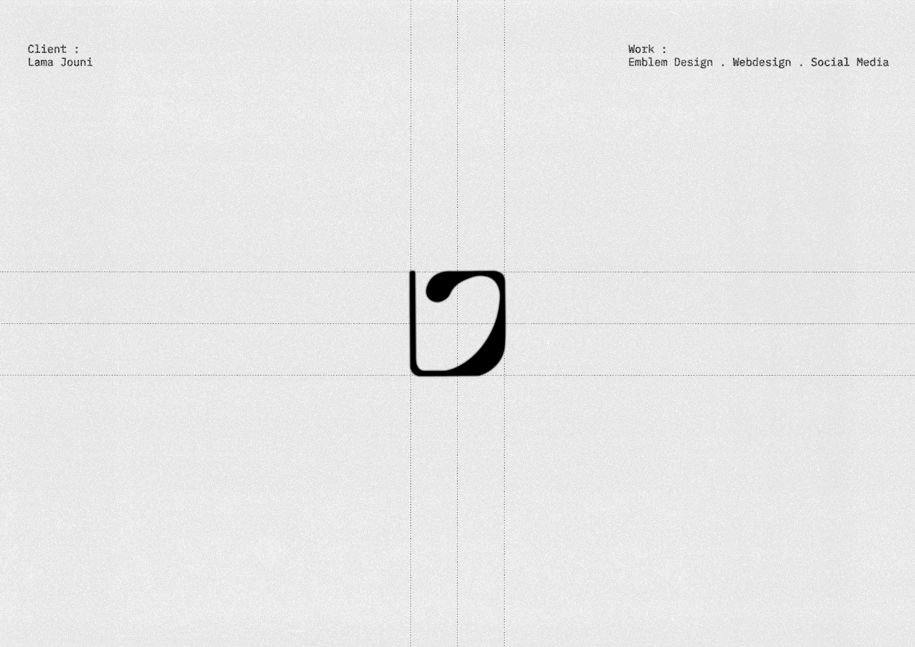
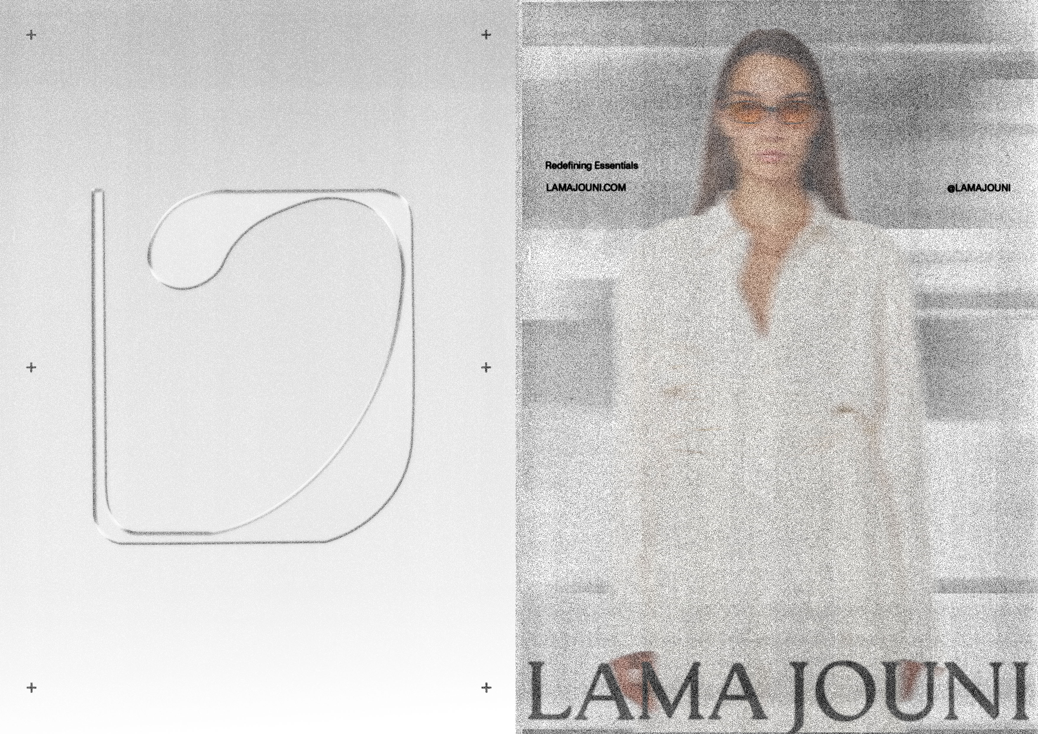
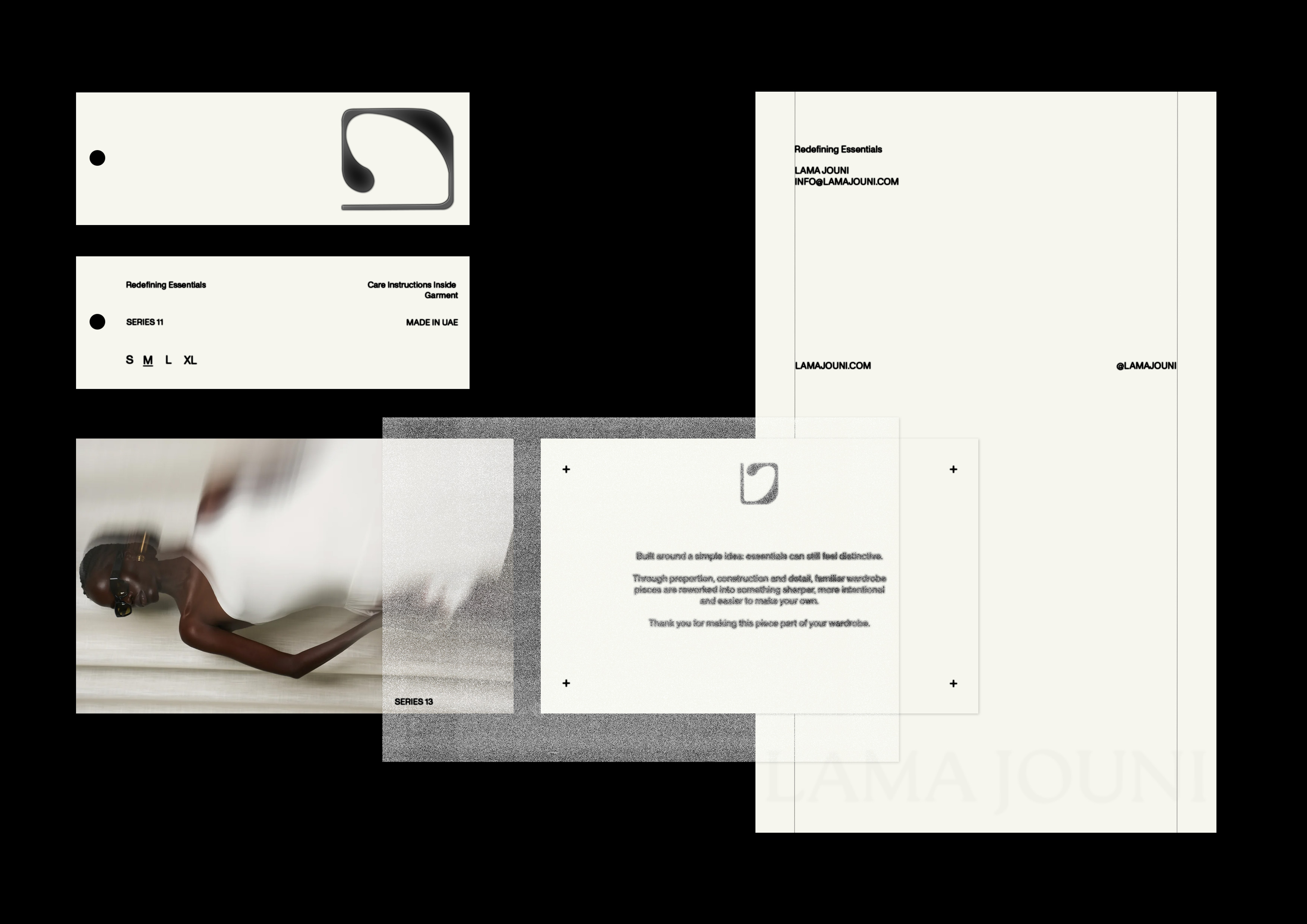
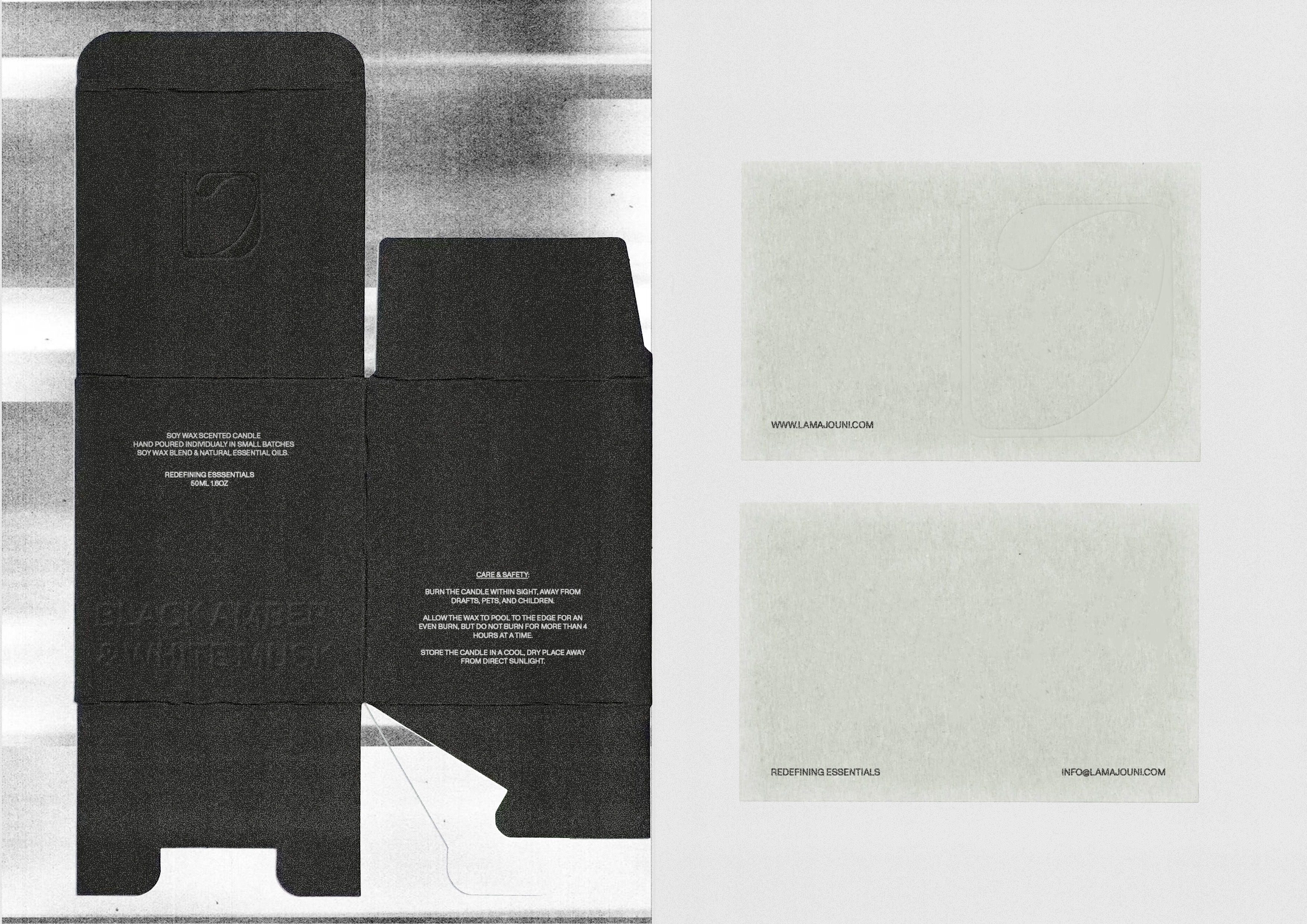
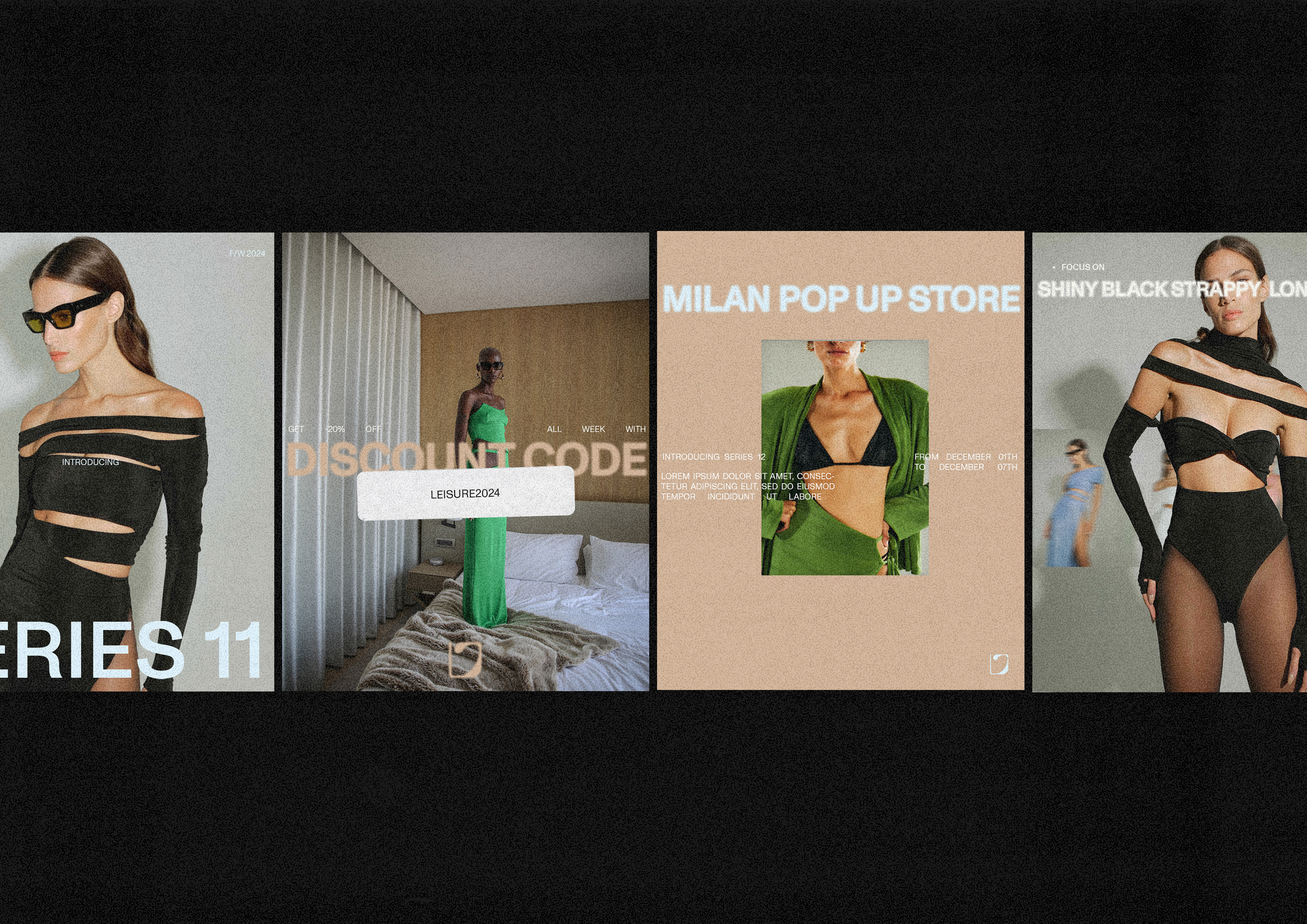
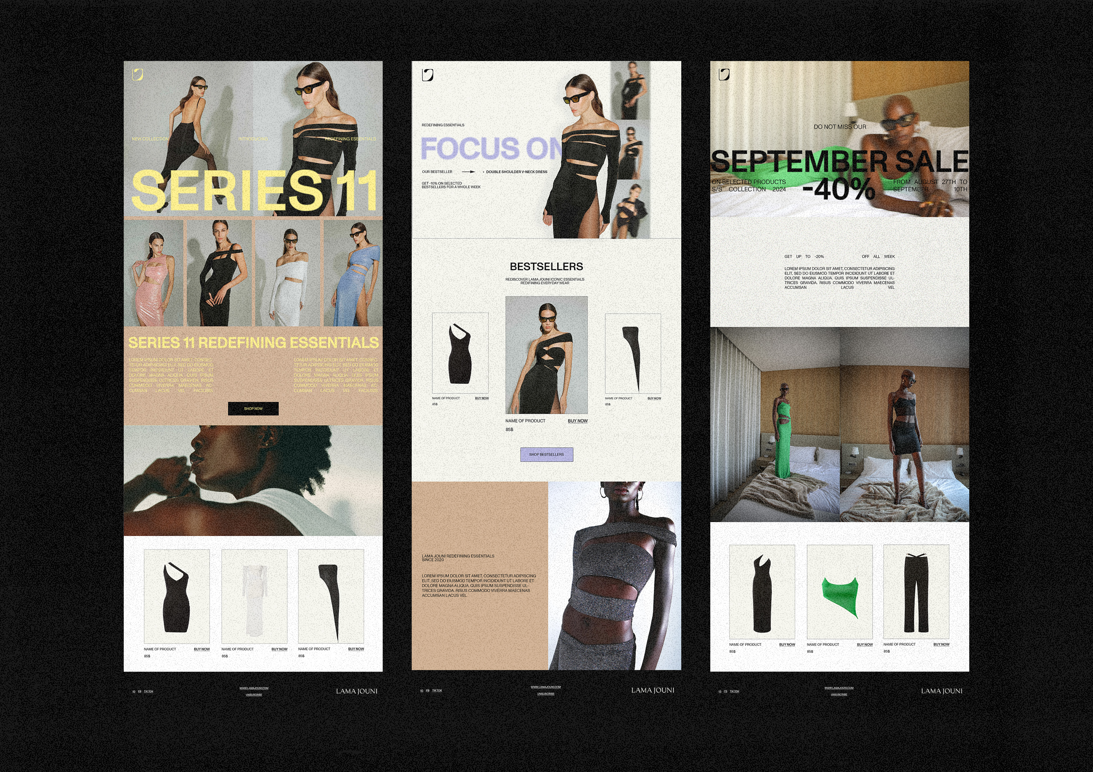
Lama Jouni has always lived in that space between ease and precision, essential pieces with enough attitude to never feel basic. The work started by finding a symbol that could hold that tension. Built from the letters themselves, the emblem was shaped through curves and proportions until it became one complete form, carrying a subtle 70s–90s fashion-house character. From there, the same logic extended across packaging, web and social, giving the brand more cohesion, recognition and depth without disturbing the energy that was already there.